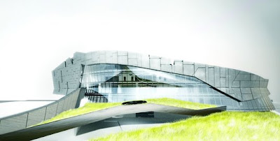
It's not as if the building is aesthetically unpleasent or uninteresting, in fact the subtlety of the lines that define its identity can cause a positive impression effortelessly in almost anyone, and these so called (or self proclaimed) celebrity architects have proven beyond any reasonable doubt their sensibility towards beauty... enough with this superficial beddazzlement undressed of valuable input. We all know you can do it, but i'm longing for an example of starchitecture that presents some novelty, not the same old repetetition of invention or inovation. It's tiring to perceive over and over again this (almost) agonizing sense of entitlement to the notion of place, as if everything should now morph into what they concocted in their minds, stripping selfishly the site of some characteristics that might have once existed. This is not addition, only subtraction.
Just to ilustrate: not long ago in an interview for The Guardian about Hannah Pool, Zaha Hadid was asked if because of the fuss about the cost, and the recession she wished she had designed a more modest building. She answered:
"No. In these moments of recession, uplifting the spirit is even more important and we should learn from things that were done in the past that were done in a hurry."
This answer reflects plain stupidity and the typical illusion of someone who just gave up on dwelling in this world. I'm exagerating, of course, but this answer is, nonetheless just weak sauce.
"It's quite unfortunate to witness someone who started her career with one of the most challenging approaches to convention and norm, now embracing this impudent architecture of representational power. And practice it without a hint of reflection on plain economic legitimacy, not to mention morality." (quote from a barriga de um arquitecto)
Despite...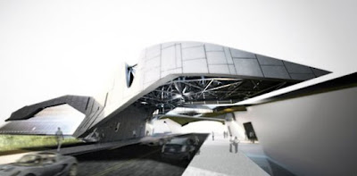
Located on the western outskirts of Shanghai, China, it's constructed of concrete, steel and glass. The new corporate headquarters of Giant Pharmaceutical Corp looks for all the world like something between a sci-fi battleship landing on a highway, and a steampunk dragon frozen in time. L.A.-based architectural firm Morphosis is focusing on the building’s sustainability as much as its aesthetics, with a green roof, generous use of skylights, and advanced insulation materials like cement-fiberboard paneling and a double-layer, fritted-glass curtain wall.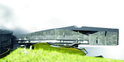
Slated for completion in 2009, the project will house executive offices in the cantelievered “head” of the structure, while the remaining elements—additional offices, a boutique hotel, exhibition hall, auditorium, library, gymnasium and swimming pool—will be contained in the “body” which arcs over a four-lane highway.
“In China, you can do things formally you just can’t do in the U.S. — aggressive, uncompromised, out-there ideas” said Morphosis principal and Pritzker Prize 2005 winner Thom Mayne, clearly implying that aesthetic and economic concerns outweigh ethical considerations. Sadly, Mayne’s is the prevailing attitude among today’s brand-name architects.
Labels: Architecture, China, Sustainability, Sustainable Design

For those fond of top ten lists and energy efficiency, the EPA has just released its list of the US cities with the most commercial buildings earning Energy Star ratings in 2008. EPA is quick to point out that the number of building qualifying for this rating have increased 130% from 2007, and these buildings both use 35% less energy than average buildings and emit 35% less CO2. So without anymore more hesitation, here they are:
1. Los Angeles
2. San Francisco
3. Houston
4. Washington DC
5. Dallas-Fort Worth
6. Chicago
7. Denver
8. Minneapolis-St Paul
9. Atlanta
10. Seattle
In order for a building to qualify for an energy star rating, it must score in the top 25% using EPA's National Energy Performance Rating System. For a complete list of Energy Star rated buildings: Energy Star
Labels: Green, News, Sustainability, Sustainable Design, U.S.A.

I'm one of those who some years ago bought a Mac Powerbook, and have never even thought or contemplated updating my computer with anything else other than another product manufactured by Apple... (In my opinion) They are just miles away from the regular thing.
Well if that wasn't enough for you, maybe you have another reason now, to at least think about it. It's not just because they are more intuitive, user-friendly or (lets face it) better looking; in fact, "the highly recyclable, even more energy-efficient MacBook family has been designed with the environment in mind."
. Many harmful toxins eliminated.
. Highly recyclable.
. Reduced packaging.
. More energy efficient.
. Longer-lasting battery in 17-inch MacBook Pro.
. EPEAT Gold.
. A commitment that starts with products.
Read more here
Labels: Green
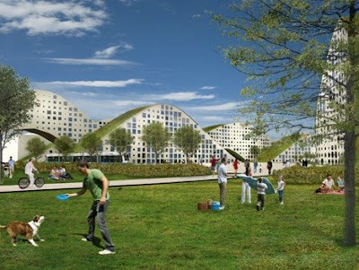
Roofs are for people, and should be green and accessible. That is what is so exciting about New Heden in Gothenberg, Daniel Andersson's final thesis at Jönköping University, with Fredrik Kjellgren and Joakim Kaminsky of Kjellgren Kaminsky Architects. as tutors. The form of the buildings, "built as sliced hills with grass roofs that can be walked upon" brings the green roofs right down to grade, making them accessible; rooftops become terrain.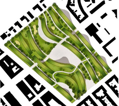
New Heden looks green from above. Even though denser developed it has a much greater biomass than its predecessor. Local cultivation of fruits and vegetables is a natural part of living in the area. Grass roofs and parks enrich the animal life and plant life and let nature become an integrated part of the city centre. They also absorb rain water that can be purified and reused as household water.
It is interesting to see how the development of green roofs is actually changing architecture and design.
Julien de Smedt Architects also did a proposal for Rimini, Italy that brings green roofs down to the ground and makes the roofscape part of the terrain.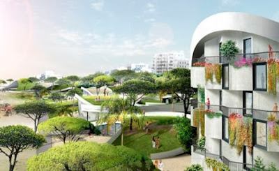
Designboom describes it:
"The powerful and recognisable pattern evokes sand ripples and sea waves and has the incredible ability to allow both longitudinal and transversal connections : to facilitate the meanderings of passers-by strolling along the boardwalk while at the same time integrating the street connections coming from the city."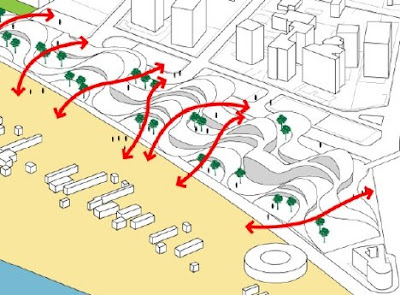
But the most interesting feature is the way the town connects to the beach by essentially walking over the building. 
Labels: Architecture, Green, Italy, Sustainability, Sustainable Design, Sweden
Art as a form of raising awareness is always refreshing, in that context I came accross this project which in my opinion is closely related with the one in the previous post.
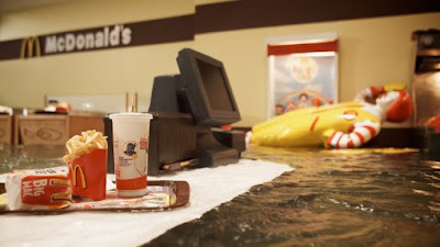
Superflex's apocalyptic new work explores the path that leads from consumption to catastrophe, comprising Jakob Fenger, Bjornstjerne Christiansenand Rasmus Nielsen, they have worked for over 15years on a wide range of projects that deal broadly, and distinctively politically, with global issues. Much of their work has been built around ideas of democratising production and consumption processes — as in their open-access TV channel Superchannel, their work Supercopy that challenges ideas of legal copyright, or the soft drink Guaraná Power they created with Amazonian farmers to challenge the stranglehold multinational beverage manufacturers on commodity prices. But Flooded McDonalds, the second in a series of new films is an example of their intersest in the relationships between global warming and our role as consumers.
Flooded McDonald's from Superflex on Vimeo.
Labels: Climate Change
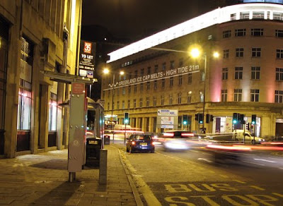
Sea levels are rising due to climate change... but how much could they rise and how quickly? And how could this affect us?
Watermarks is an artist led, public art project that will use a series of large scale projections at sites across the centre of Bristol to explore these questions...
Flood level marks are projected on to the sides of buildings, showing how high water levels could potentially rise as the sea inundates the central, low lying areas of Bristol. By displaying these levels in real space, the project aims to help us to imagine the depth and extent of this potential future flooding - allowing us to measure them against ourselves in familiar environments.
The complexity and inherent uncertainty involved in predicting sea level rise means there is little consensus across the global scientific community as to how much sea levels could rise in the coming decades. The Watermarks project will use current UK government predictions for the next century to set key flood mark levels. The project, however, will also acknowledge uncertainty explore other scenarios.
Chris say: "Although the message is stark, the flood levels shown are as if the city is undefended and adaption measures have not been put in place. As the waters gradually rise over the coming century, there is much we can do to adapt and defend!
"This project contends that the future of our cities and landscapes and our responses to rising sea levels are not just left to scientists, politicians, engineers and the built environment professions but emerge from as wide a base as possible with participation and involvement from all sections of the wider community. Ultimately the mitigation and adaptation measures will be social and cultural as much as scientific and technical."
The site-specific installation runs in conjunction with a website and workshops that are intended to encourage debate and creative participation of the audience.
Labels: Climate Change, United Kingdom

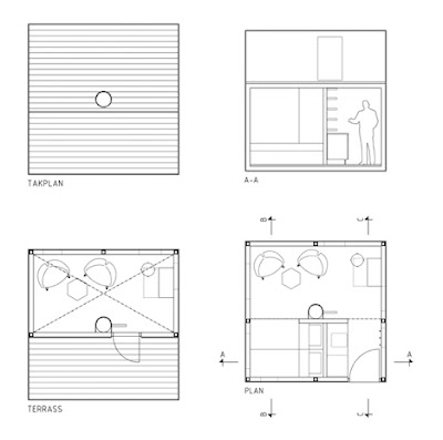
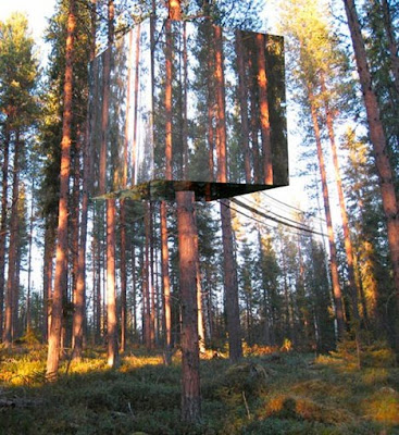
Remember when we used to plot the construction of our own treehouse with wooden planks, ropes and leaves? Not anymore it seems... Swedish firm Tham & Videgard Hansson Arkitekter designed a fancy new TreeHouse that minimizes its visual impact on Nature. It's an interesting concept though i'm positive it ruins the idea and the magic behind the point of having such a construction. On the other perspective, it also creates an all new dimension of illusion to rejoice upon. Check Tham & Videgard Hansson Arkitekter for more information.
Labels: Architecture, Fun
He is one of the most liberal and progressive congressmen in the U.S. today. He has a true passion for preserving the environment and advocates cycling quite strongly by trying to create proper infrastructures, passing bills (and by riding his bike to work everyday dressed in an expensive suit, a bow tie and a colourful pin of a bicycle).
video taken from Street Films
Labels: Fun, Green, Manhatan, Sustainability
This space is about architecture, innovation, sustainability and any other subject that might be interestingly related to the preservation of hour home.
Archive
- December 2008 (19)
- January 2009 (11)
- February 2009 (13)
- March 2009 (3)
Tags
- Abu Dhabi (1)
- Architecture (26)
- Asia (7)
- Aston Martin (1)
- Australia (1)
- Azerbaijan (1)
- BIG (1)
- Blogosphere (1)
- Caribbean (1)
- China (3)
- Cinema (1)
- Climate Change (2)
- Design (9)
- Fire (1)
- Foster + Partners (3)
- Fun (8)
- Green (25)
- Hong Kong (1)
- Italy (1)
- Japan (1)
- Manhatan (2)
- Middle East (1)
- News (2)
- Performance (1)
- Photografy (1)
- Poll (2)
- Singapore (1)
- South Korea (1)
- Sustainability (25)
- Sustainable Design (19)
- Sweden (1)
- Taiwan (1)
- TED (5)
- Thailand (1)
- Travel (1)
- U.S.A. (1)
- United Kingdom (1)